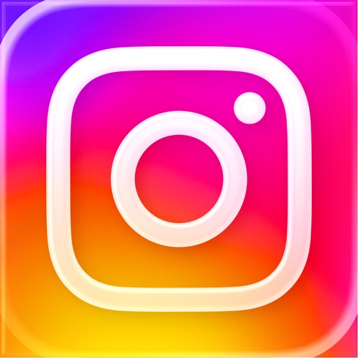
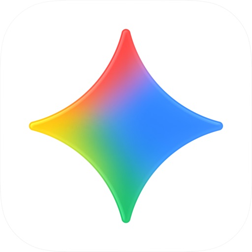
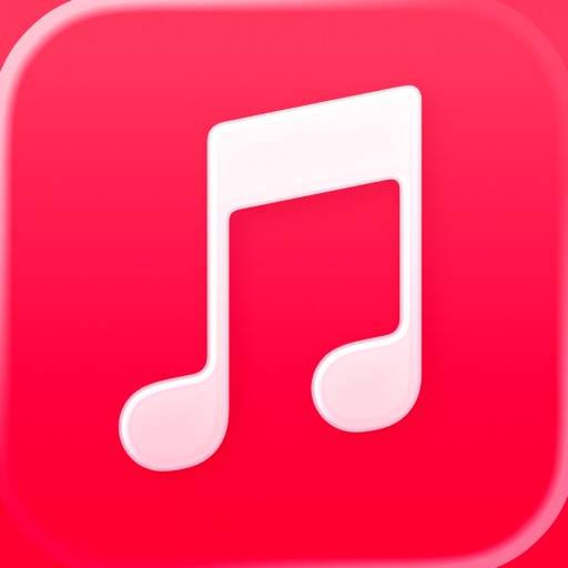
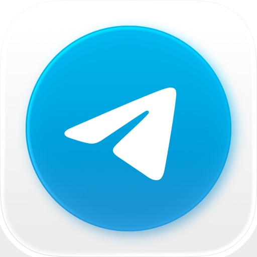
以下图标均为 App Store 在架应用官方图标,仅作风格参考,版权归各应用所有,来源见各图链接。
为什么它商业化有效
✓质感免费:一层渐变顶得上拟物时代一堆高光,图标立刻「贵」起来
✓白色前景最省事:符号不用考虑与底色融合,永远清晰
✓深浅壁纸通吃:渐变自带明暗变化,不吃环境色
✓反面约束:渐变色相内卷严重,要避开 Instagram / Apple Music 已占领的区间
适合什么样的 App
社交与内容社区
音乐与影像
面向大众的消费级 AI
可直接使用的提示词
先确认渐变色相没被 Instagram / Apple Music / Telegram 占用;白色符号笔画不超过三条主曲线。
Design an app icon for {{APP_NAME}}: a smooth diagonal gradient background ({{COLOR_1}} to {{COLOR_2}}, optional third hue), a single white outline glyph of {{SUBJECT}} centered, no text, soft light sheen, rounded-square iOS icon format, 1024x1024, flat modern style like a top-charting consumer app.