Gradient
The gradient 'premium feel' is the most validated recipe there is
A colorful gradient base plus a white line glyph — since Instagram this has all but become the uniform of consumer breakout apps. The gradient gives a static icon light and depth while the white foreground keeps the glyph clean. Only To-C products dare saturated gradients — the signal is 'popular, energetic, worth opening'.
Proven in the market

Swapped the skeuomorphic camera for a pink-orange-yellow gradient and within months 'candy' became its unofficial nickname.
Source: App Store ↗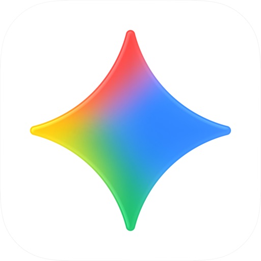
A blue-violet gradient sparkle — Google unified its entire AI line under this breathing light effect.
Source: App Store ↗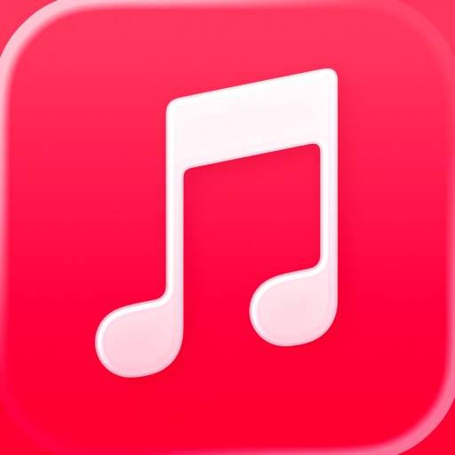
A white note on pink gradient: the most 'neon' tile in Apple's own grid, aimed straight at young music scenes.
Source: App Store ↗
A paper plane on blue-cyan gradient, camped opposite WhatsApp green; the gradient gives the plane volume.
Source: App Store ↗All icons are live App Store icons shown for style reference only; copyright belongs to each app. Sources linked per image.
Why it works commercially
- Free premium: one gradient replaces a whole skeuomorphic highlight stack — the icon instantly costs more
- White foreground is lazy-proof: the glyph never has to blend with the base
- Works on light and dark wallpapers: gradients carry their own light
- Constraint: hue real estate is crowded — avoid the ranges Instagram / Apple Music already own
Best suited for
- Social and content communities
- Music and video
- Consumer-facing AI
Ready-to-use prompt
Check your gradient hues aren't already Instagram / Apple Music / Telegram territory; keep the white glyph under three main curves.
Design an app icon for {{APP_NAME}}: a smooth diagonal gradient background ({{COLOR_1}} to {{COLOR_2}}, optional third hue), a single white outline glyph of {{SUBJECT}} centered, no text, soft light sheen, rounded-square iOS icon format, 1024x1024, flat modern style like a top-charting consumer app.